A modern design with a well-organized website structure encourages visitors to convert because an up-to-date website has a high trust factor. We all are more likely to reach out to a company with original pictures or videos, responsive design, and a good website structure than a company with a website made in the early 90’s, which has stayed the same since.
If your website needs an update and you need help determining which way to go, check out our list of the best moving company website designs. One of them may inspire you enough to take that next step toward a new and improved website for your moving company!
15 Best Moving Company Website Designs
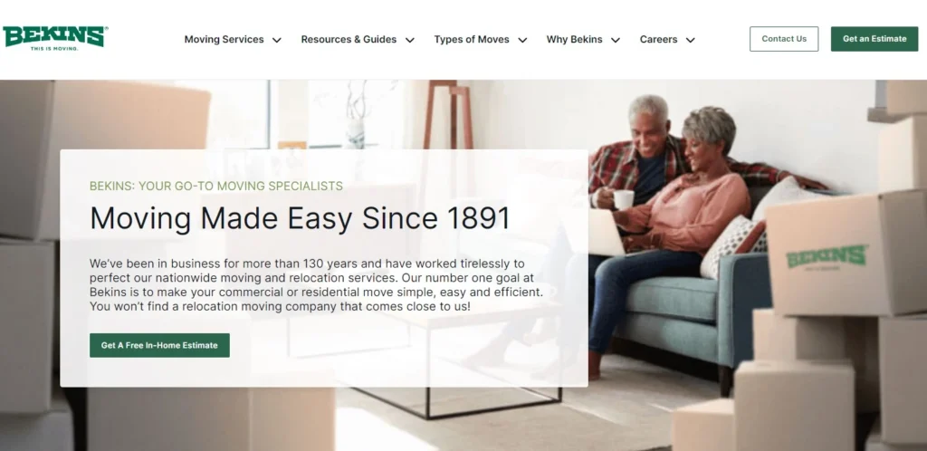
Bekins
Bekins is one of the giants in the industry, so it is not surprising to see them on this list. The entire design doesn’t feel crowded with information, and the website structure is on point, with pictures with details about their moving company. It can be boxes with Bekins, moving trucks carrying their logo on the side, or moving teams in dark green uniforms (their official color). Their menu is easy to navigate because all you need to know about their moving service is there.
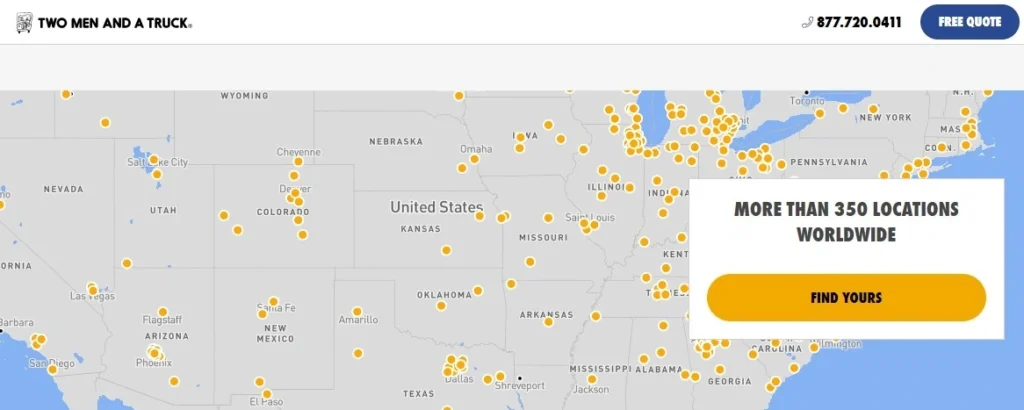
Two Men and a Truck
Two Men and a Truck have a recognizable style that spreads from logo to icons on the website. This cartoon-like design gives them a relaxed vibe, but the statistics show they are professionals. Their homepage is straightforward, showing their primary services, locations, and reviews. The menu, on the other hand, is different from your usual menu because it is in the top right corner, making their web stand out.
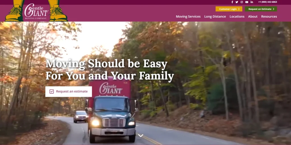
Gentle Giant Moving Company
The first thing we like about Gentle Giant’s website is that they aren’t afraid to use bold colors in their brand. We also like the video of their moving projects on the home page. The second thing we like is the menu; you can easily find what you want, from their moving services to locations, information about the brand, etc. They even have an educational section for sharing tips and advice, which shows us they know what they are doing.
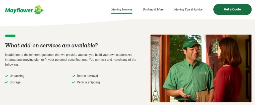
Mayflower
Mayflower is another strong name in the industry. We like their clean design without too many distractions like videos, too many images, etc. In this case, simplicity is the key, and if you want a simple design, this website is what you should use as an inspiration. The menu on the top of the website has three sections – moving service, other services, and an educational category filled with tips and advice.
Luxury Movers Moving Company
Luxury Movers Moving Company has a website with an impressive structure. You can go anywhere you want from their homepage (without clicking on the menu); you have to scroll and find what you are looking for. You can book a move, decide on the moving service, double-check their service area, and even read reviews of their past customers and see pictures of past projects. Once you decide on the section you are interested in, click on a separate web page to find the details you want.

Bellhop
Bellhop is another website with a white-green color combination, which seems the most popular combination in the moving niche. We can’t blame them, it is a good color combo! What we recommend is taking a look at their moving service pages. They are very detailed, describing their service, FAQs, checklists, tips, and service areas. They have both useful and educational content on them so you can learn a thing or two from them. The only thing lacking is one or two reviews, and they would be perfect!

Pure Moving
Pure Moving has a website with a slightly different concept. Most websites (until now) focused on representing their skills and services. When you enter their homepage, you will notice they are more focused on showing their relationship with customers and reasons to hire than their actual service. That means trust is an extremely important criterion for their customers, and they respect that. If you also want to emphasize your relationship with customers, this website is an excellent source of inspiration for your moving company.

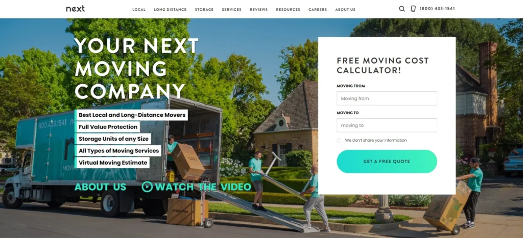
Next Moving
Next Moving has a strong call to action on the top of the page in the form of a free moving cost calculator so anyone familiar with their brand can immediately ask for a quote. Their homepage design combines moving service portfolio and trust categories because first, you get to see their services, and after that, you can read why they are a good fit for your needs. If that still doesn’t convince you they are a legit company, you can scroll down and read reviews from different platforms like Google and Yelp.
Einstein Moving Company
Einstein Moving Company is another pretty quirky website of a professional moving business. The first thing you can notice (besides the intro video) is a list of awards they got for their achievements. After that, they share with you why they work with them and the locations where they operate. If you like their design and want to use it as an inspiration, don’t forget to mention your moving services.

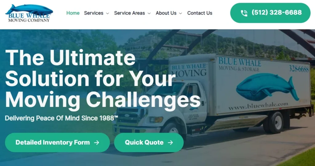
Blue Whale Moving Company
Einstein and Blue Whale have similar homepage beginnings, but Blue Whale has decided to go with the intro picture instead of a video. What makes them so similar is the awards list right below the intro. It is a good way to show people you are good at what you do, but there are more important things to put at the top of the homepage. The Blue Whale Company shared reasons to work with them, but they’ve also focused on moving services and areas they serve, so they covered more ground than the brand above.
Moving Squad
If you are a business owner who likes to be direct and on point, then Moving Squad website design might be an excellent option. As you can see, when you enter their website, they invite you to work with them through a detailed contact form. They are a little on the heavy side regarding content volume, but we like their pictures. They are genuine and represent their company through trucks, moving teams, and past projects. Also, they are one of the few brands with their app.

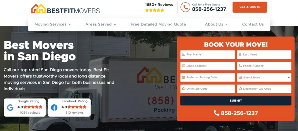
Best Fit Movers
Best Fit Movers Company is another brand that loves direct marketing and isn’t afraid to use strong calls to action. These San Diego movers know how to show they are one of the best in the business. On the top of the homepage, they have both contact forms – calls and emails so you can choose which one you prefer. We can see their Google and Facebook ratings and pictures of their moving trucks, teams, and projects. At the bottom of the page, they also have reviews, so if you want to keep your trust factor high, consider a design similar to theirs.
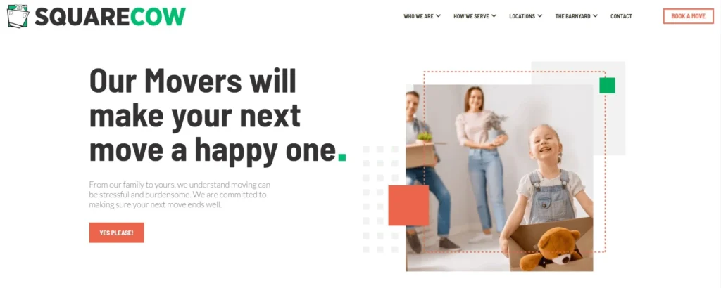
Square Cow Movers
Square Cow Movers company has a website with a well-known green and white color combination, but they added a dash of red to their design. Their clean website is easy to navigate. What we like about this design is that their calls to action are visible but not too aggressive, which gives them a relaxed and family-oriented vibe. If you, too, want people to see you as a family-matters moving company, use their website as an inspiration!
Reeseo´s Movers
Resseo’s Movers is one of the shortest websites on this list. It is an excellent example of a website for a company that just started its moving business. The homepage has genuine pictures and a short description of their moving services, which you can click on to learn more about. You don’t have to wonder about their service area because they put it in the top right corner, next to the contact number. So, if you are starting your business and aren’t sure how to organize your web, this is a good starting point.

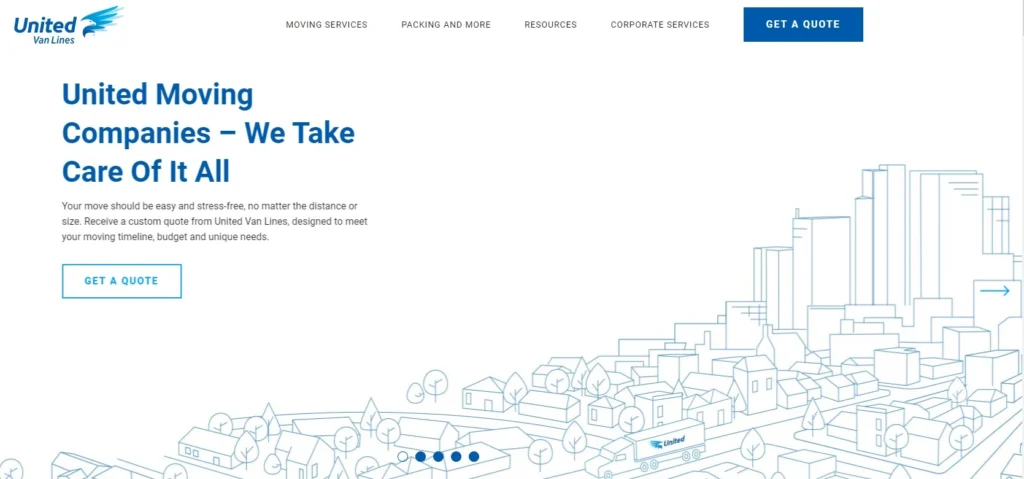
United Van Lines
United Van Lines is a giant in the moving business, and we’ve put them on this list because they have absolutely every option you may need on your moving business’s website. They have a clean and easy-to-use design, moving services, and location (like other companies), but they also have a newsroom, shipment tracking, becoming an agent or driver for them, etc. If you are considering making a franchise of your moving business, United Van Lines is a company that should be your inspiration since they have been doing it forever.
Do You Know Which Web Design To Use?
People are primarily visual, so an inviting web design will help you catch their attention and sell your service. The era of aggressive websites is over, so our primary recommendation is to go with a straightforward design, good website structure, and excellent loading speed.
Most people don’t have time to search your website for information that should be easily available. That is why a modern web design usually means having an easy-to-locate menu, good-quality pictures, and short and on-point paragraphs filled with helpful content with strong calls to action.
If you can get lost on your website, you can be sure a person who is there for the first time in their life will be too. Avoid that scenario and keep it simple, organized, and straightforward!
With this post, we have only scratched the surface of a good web design for moving companies. If you want to know more about this topic, reach out to us, and we will make you a website that represents your company best and converts visitors to customers!